Product design · 02 · Prexy
Simplifying funeral operations without losing a single field
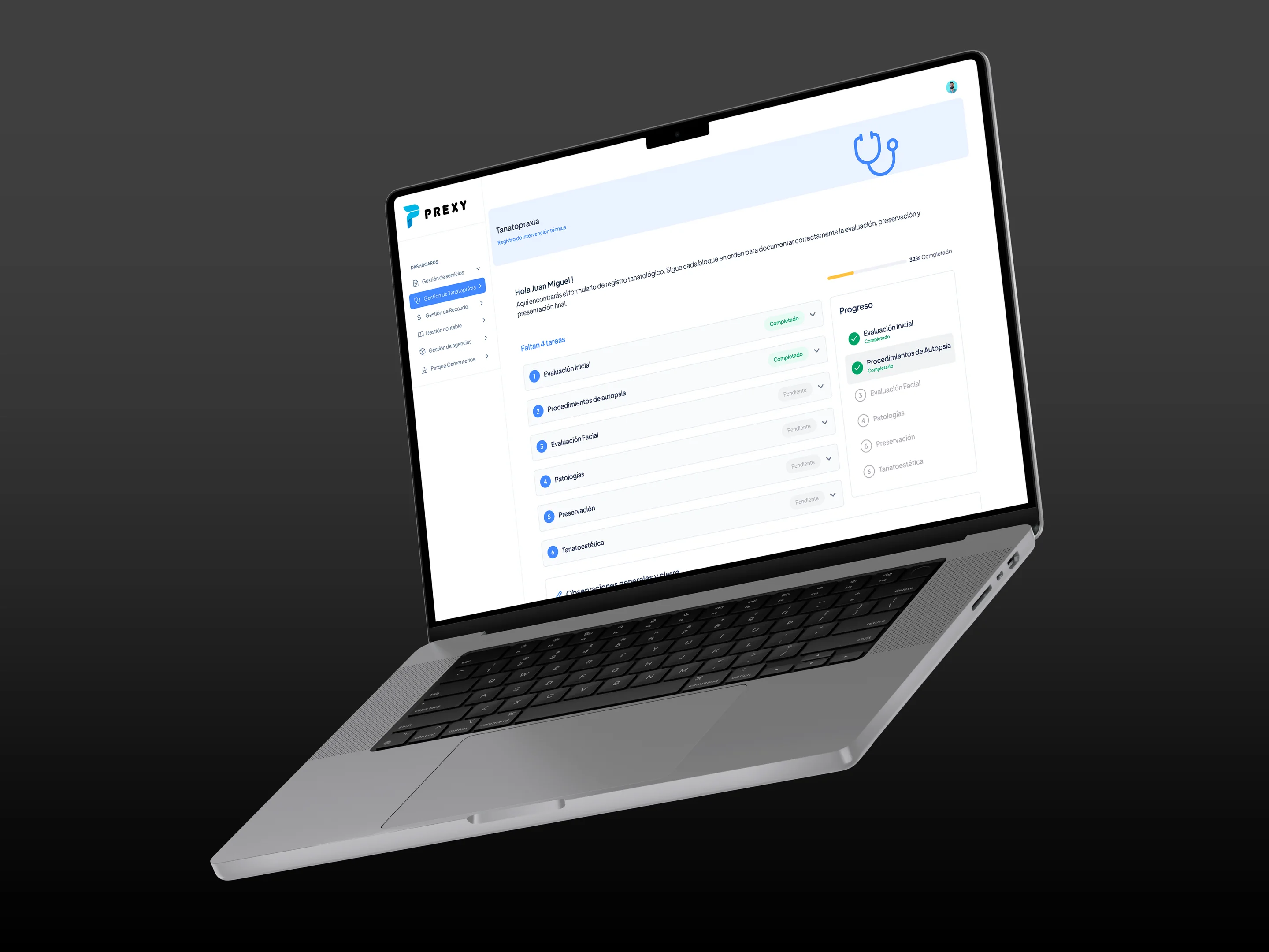
Prexy runs a funeral home end to end: services, embalming, billing, accounting, branches and cemeteries. I redesigned two of its modules so long technical forms would feel simple to fill in.
01
A funeral service can’t be half saved
Funeral homes run processes that can’t fail: services, members, inventory, payments and legal documents, all under time pressure and with sensitive data. Much of it still ran on paper or on generic tools never built for the industry.
Every field matters, from the requester’s name to the technical detail of a procedure. The challenge wasn’t cutting information; it was ordering it so nobody got lost or skipped a step, without the process feeling endless.
02
The hardest module: embalming
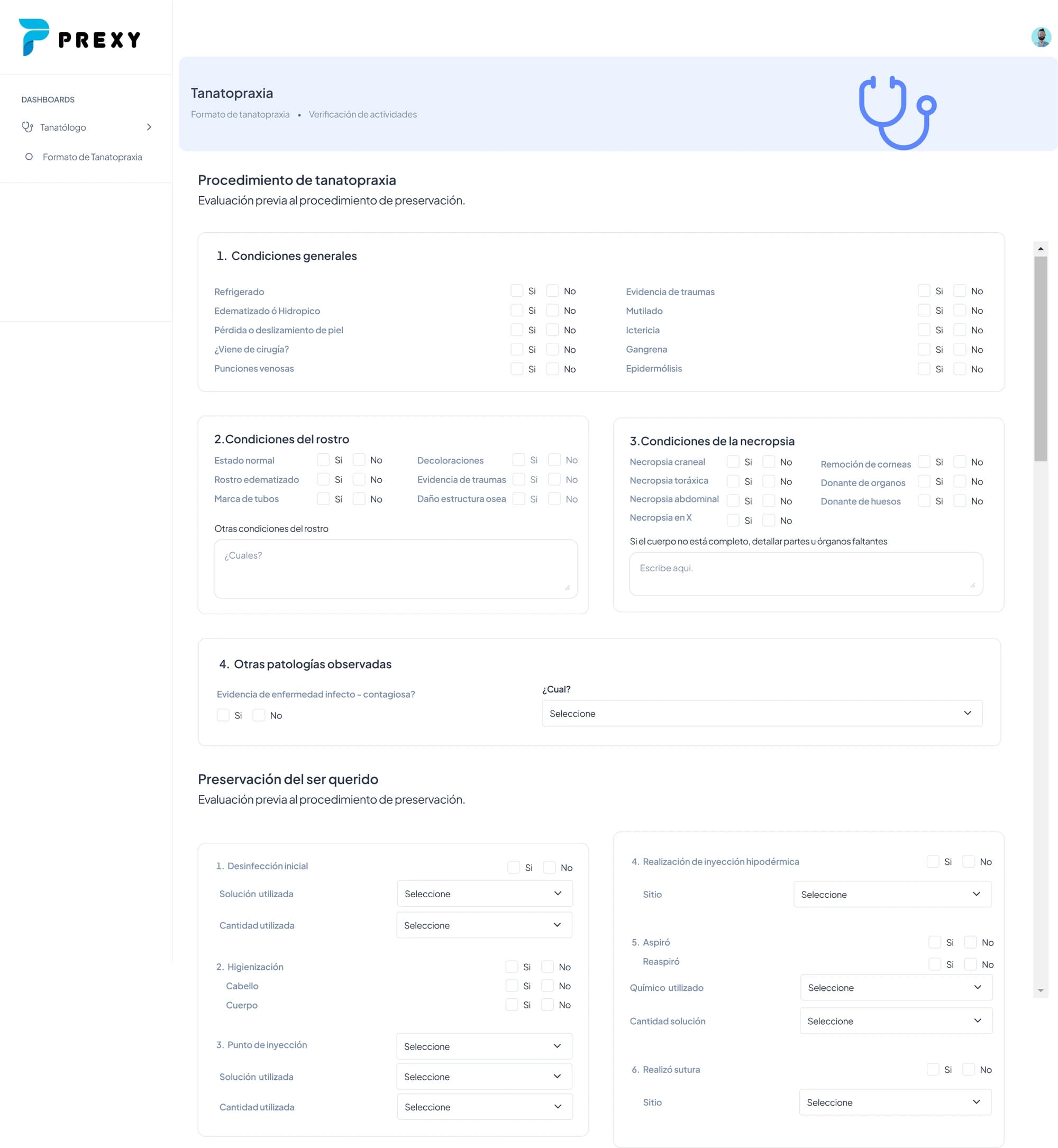
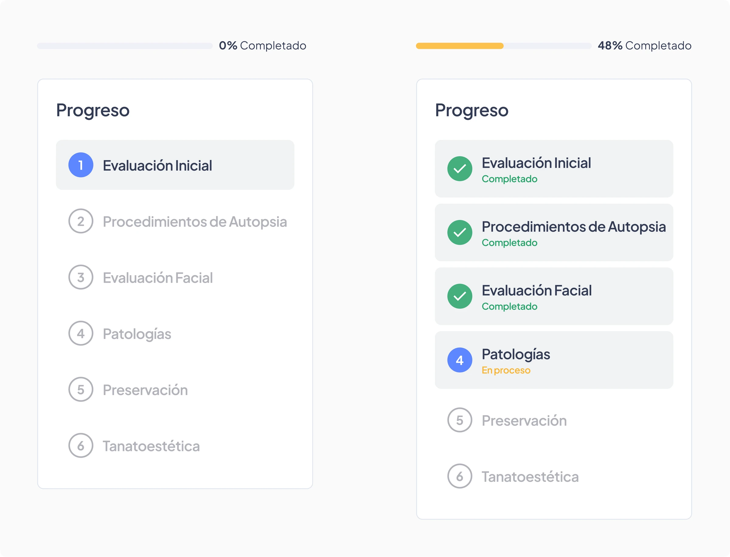
This form records the whole technical preservation procedure: what was done, with what, how much and with what result. Before, everything lived in one long view (general condition, face, autopsy, preservation and cosmetics) with no sign of where the embalmer was in the process or what was left to complete. The cognitive load was so high it felt like a paper form you fill in by hand.
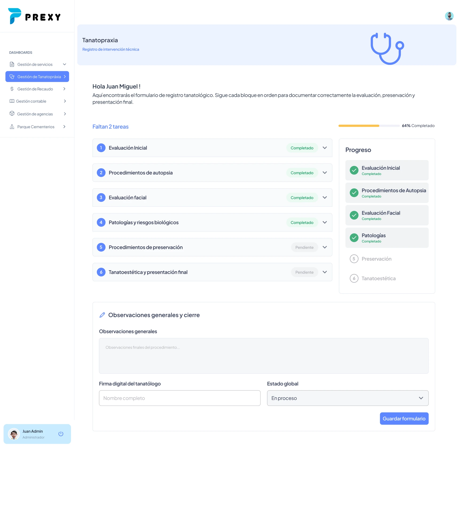
Most people in that role are older, used to doing everything on paper and not very comfortable with technology. So the goal was for them to always know where they stood: what they’d done, what was left and which step they were on, with a fluid interaction that wouldn’t punish a mistake.
03
Key decisions
| Decision | What we did | Why |
|---|---|---|
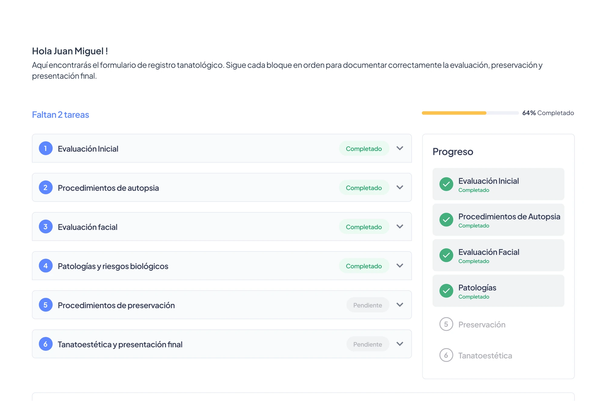
| Split it to move forward | A 6-step wizard where each step shows its status: done, in progress or pending | One long single-view form felt like an impossible task |
| Progress, always visible | A progress bar and live percentage | People no longer had to guess how much was left while scrolling |
| Only show what applies | Conditional fields: "Yes" reveals sub-fields, "No" closes the question | No empty fields, no extra clicks |
| Fewer clicks, same data | The same information with as few interactions as possible | Not a single required field was removed |
04
Second module: reports
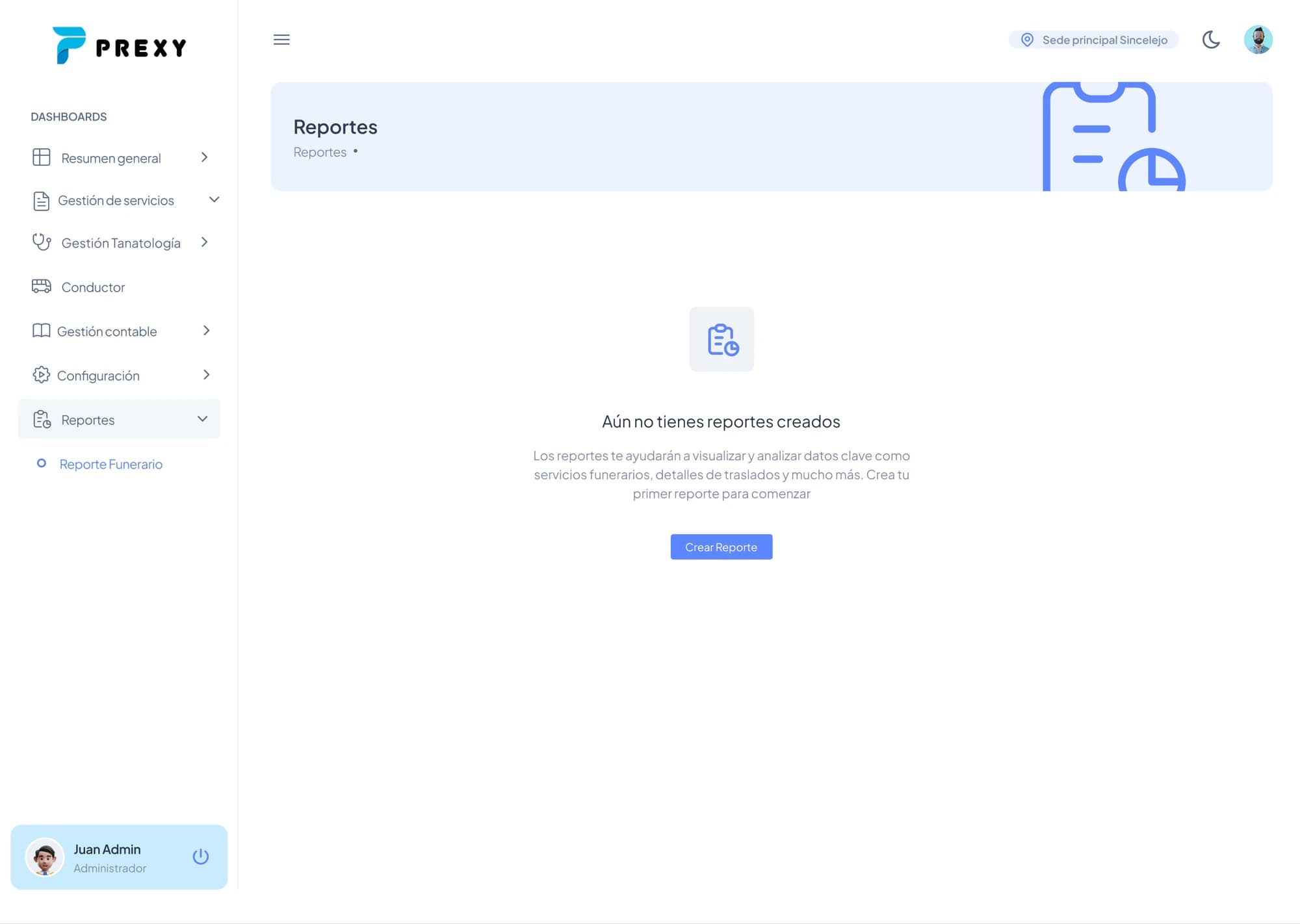
The reports module started blank: an empty state with a single button to build a report from scratch. The redesign offers two paths: build a custom report by picking the KPIs that matter, or start fast from preset funeral templates for monthly sales, embalming operations or inventory control.
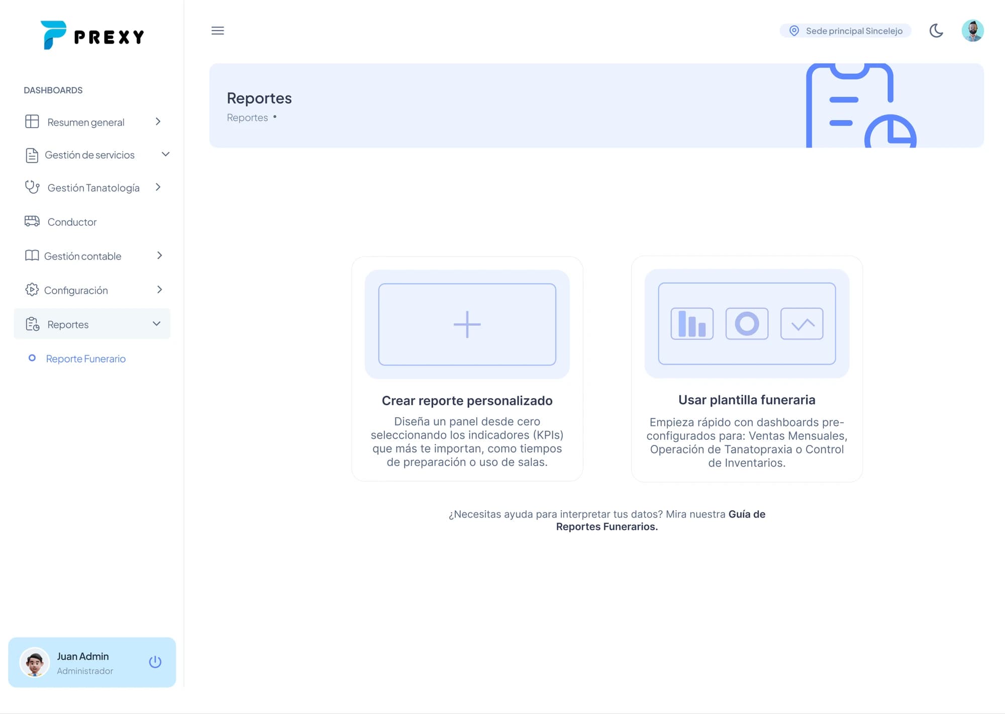
The idea was to let service coordinators start from templates set up with the criteria most used across services, instead of facing a blank screen. Building a custom report stayed available for anyone who needs something different.
05
Outcome
Prexy is piloting with funeral homes nationwide and launches with six modules: Services, Embalming, Billing, Accounting, Branches and Cemeteries.
Here’s how I’d measure the pilot’s success:
- Time to complete an embalming record, compared to the previous form.
- Records abandoned or submitted with missing fields.
- How many coordinators start from a template versus building a custom report.
06
What I’d do differently
I’d test the form with embalmers in their real work setting before locking the design. For people with little digital experience, what works on a design screen doesn’t always work in the preparation room.