Product design · 01 · Trico
Turning tax-law updates into a daily habit
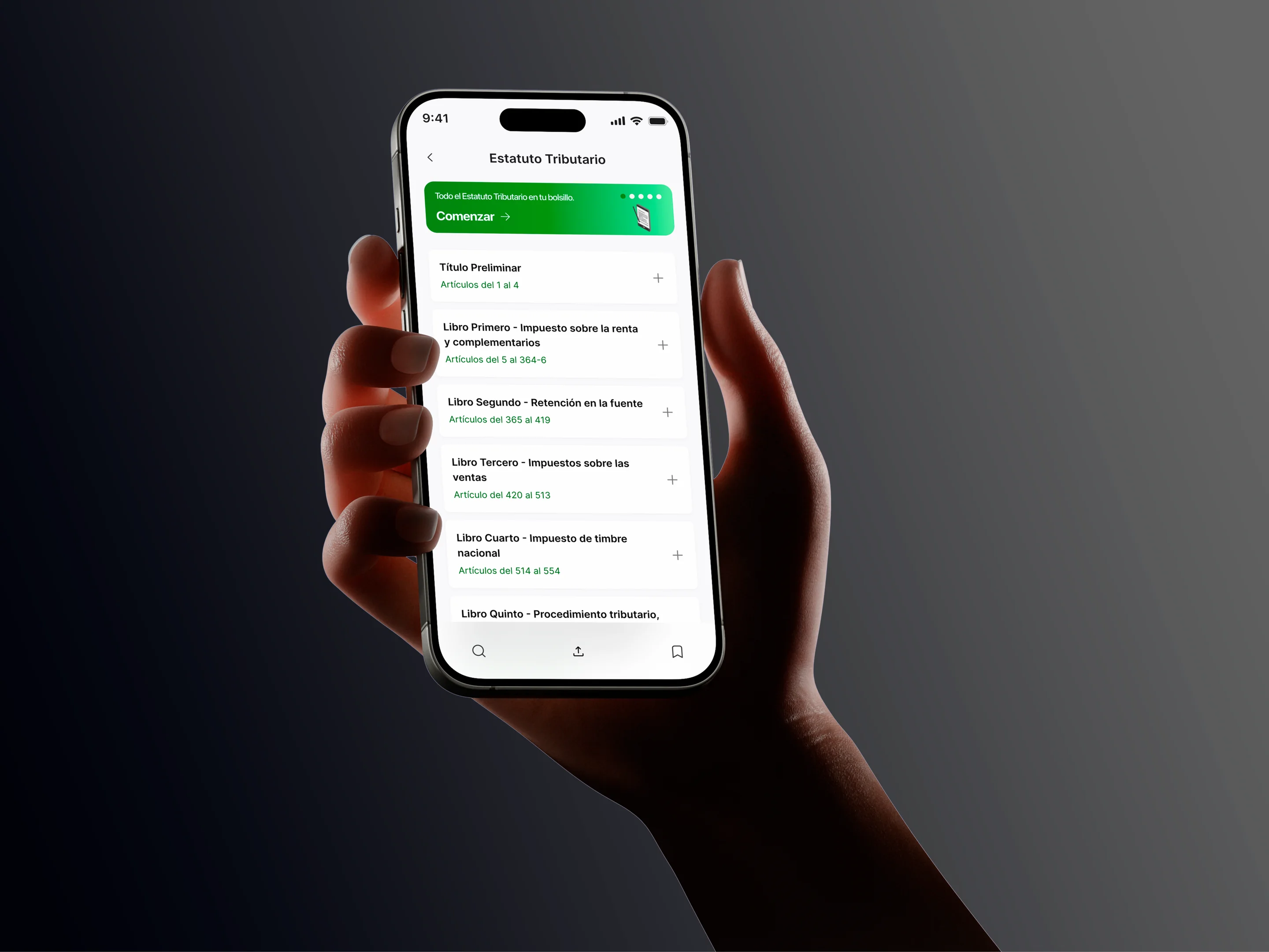
Trico brings Colombian tax regulations, decrees and DIAN rulings into one app for accountants and lawyers. Before designing the interface, I redesigned the question.
01
The problem
Accountants and lawyers in Colombia keep up with regulation in survival mode: the law sits on one portal, the decree in another PDF, and the official ruling arrives over WhatsApp. Content isn’t missing; a design layer on top of it is.
“I look up a regulation and end up with three different PDFs, a government site that won’t load and a WhatsApp group asking if anyone has the latest version.”
“The problem isn’t that the content doesn’t exist. It’s that getting to it in 2025 still feels like 2005.”
02
Reframing the brief
The client came in with a hunch: "there should be an app for this". Digging into it, we found something else: the problem wasn’t access, it was the lack of a habit. Any professional can find a regulation if they set out to; staying current, day after day, is the hard part.
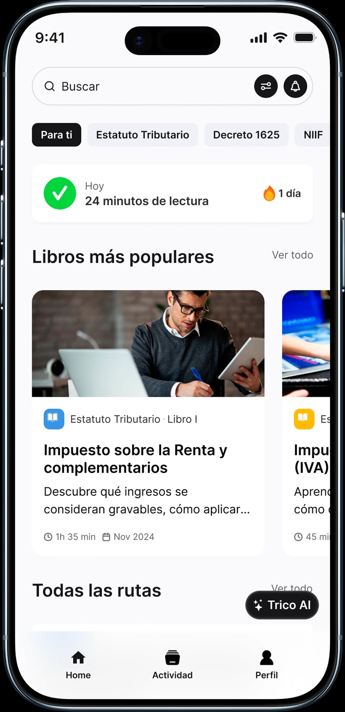
That reshaped the project. Trico stopped being a search engine for regulations and became the app that turns professional upskilling into a daily routine.
03
What we found
Findings came from surveys with professionals and from the community the Trico team runs nationwide: more than 5,000 accountants and lawyers. Three patterns emerged:
- They read in dead time: commutes, gaps between meetings.
- They’d rather listen while busy with something else.
- They lose motivation without visible progress or a sense of how peers are doing.
04
Key decisions
| Decision | What we chose | What we ruled out, and why |
|---|---|---|
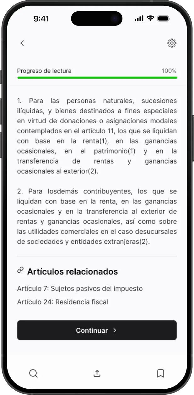
| The core of the app | Daily reading with visible progress at the center | A search screen as home: it solved access, but gave nobody a reason to come back tomorrow |
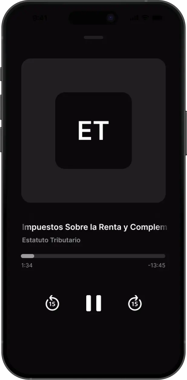
| Learning on the go | Audio for every article, without losing your place | Reading only, with audio later: it left out people who study on the move |
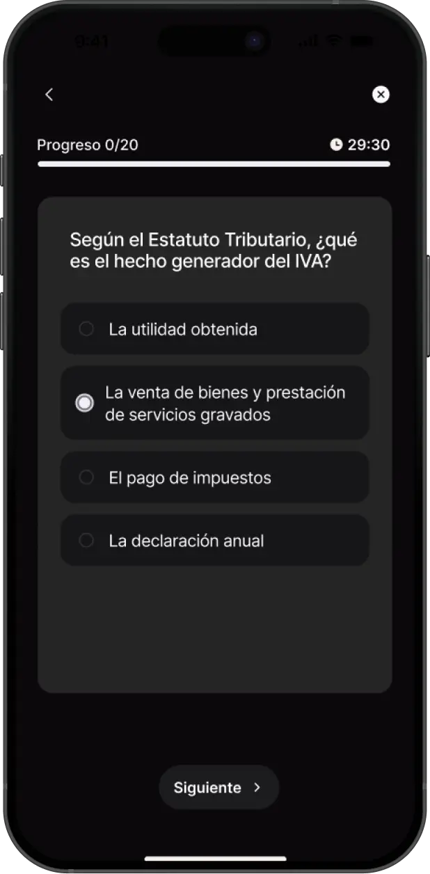
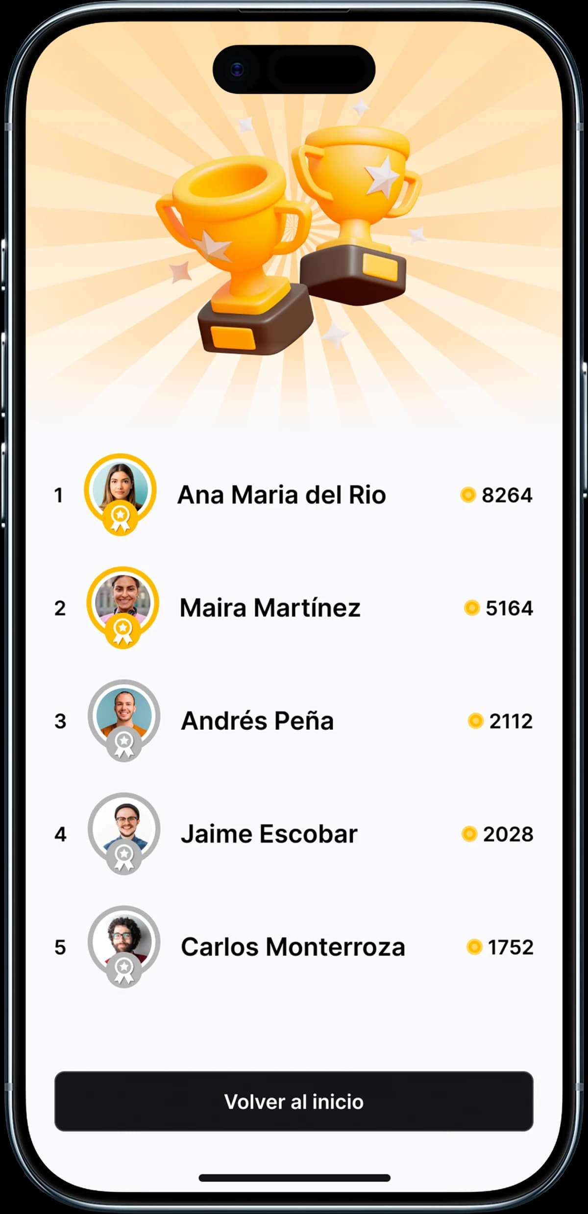
| Bringing people back | Olympiads with regulation duels and a community ranking | Generic reminders as the only driver: they get opens, not habits |
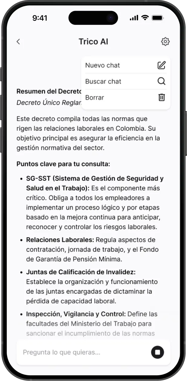
| Where AI lives | Trico AI inside the reading flow, trained on Colombian regulation | AI chat as a separate tab: it forced people out of what they were reading to ask a question |
05
Structure before style
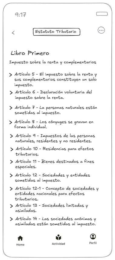
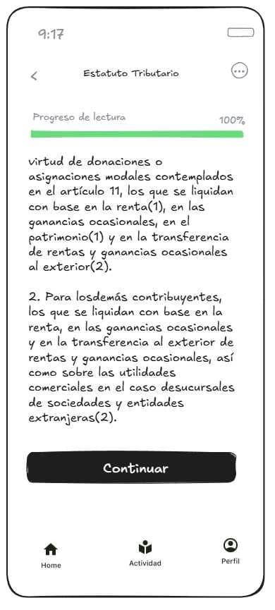
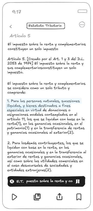
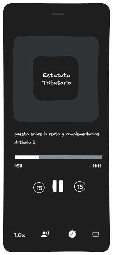
Low-fidelity wireframes focused on three critical flows: getting to an article, sensing reading progress, and switching between reading and audio without losing context. With no color or style, every layout choice had to earn its place through hierarchy alone, which let us validate the architecture with the client before investing in visuals.
06
The system
I designed Trico’s design system from scratch, with usage documentation for every component.
- Semantic tokens
- 78
- Type tokens
- 31
- Documented components
- 12
- Color signals, it doesn’t decorate: green for progress, red for DIAN documents, black for focus.
- Each content type has its own icon: module, route, book, concept and article.
- Interface icons come from a third-party library; the colored tiles for content, account and notices were designed for Trico.
Primitives · page 01 — ColorsView full size ↗
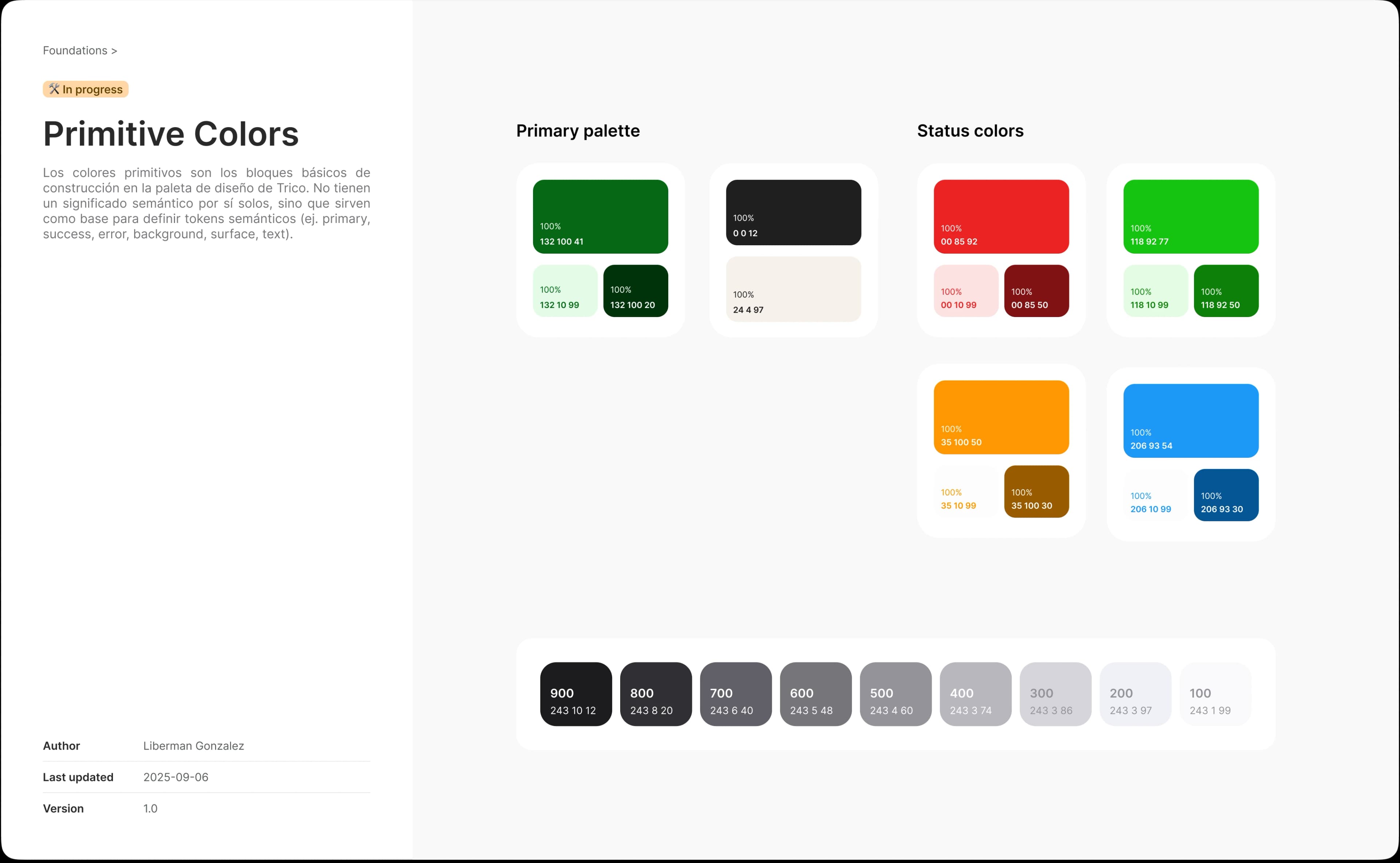
Three steps per color: light, base and dark. The tokens call them 100, 500 and 900.
Black and cream round out the brand. Black is the accent: the color of focus.
Neutrals in nine steps, from 900 to 100, all sharing the same cool hue.
Orange and blue were defined, but no background, text or border token uses them.
Semantic tokens · page 01 — ColorsView full size ↗
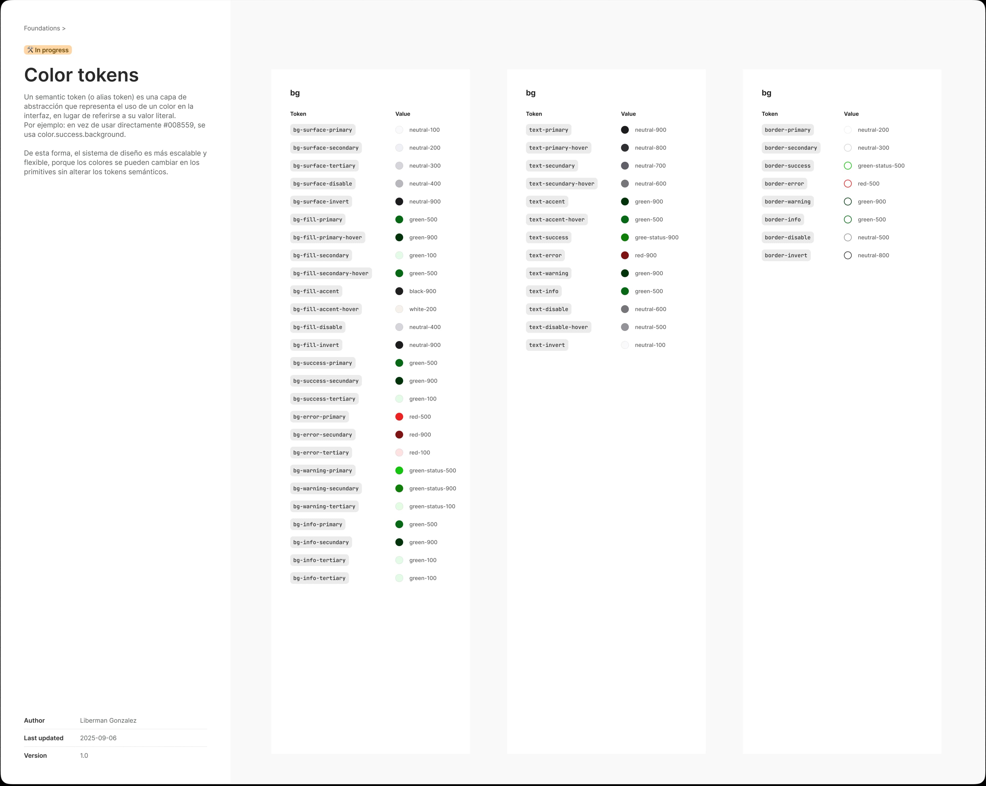
Each token says what it’s for, not what color it is: surface, fill, success, error, warning and info.
The brand green is the primary fill: actions and progress.
Warning points to a green, so it looks almost like a confirmation. Today I’d wire it to orange.
Info points to the same green as success. Today I’d wire it to blue.
Text and border repeat the pattern: text-warning and border-warning are green too.
A duplicated token and “secundary” misspelled across four groups: mistakes an automated token check would have caught.
Button spec · page 09 — ButtonView full size ↗
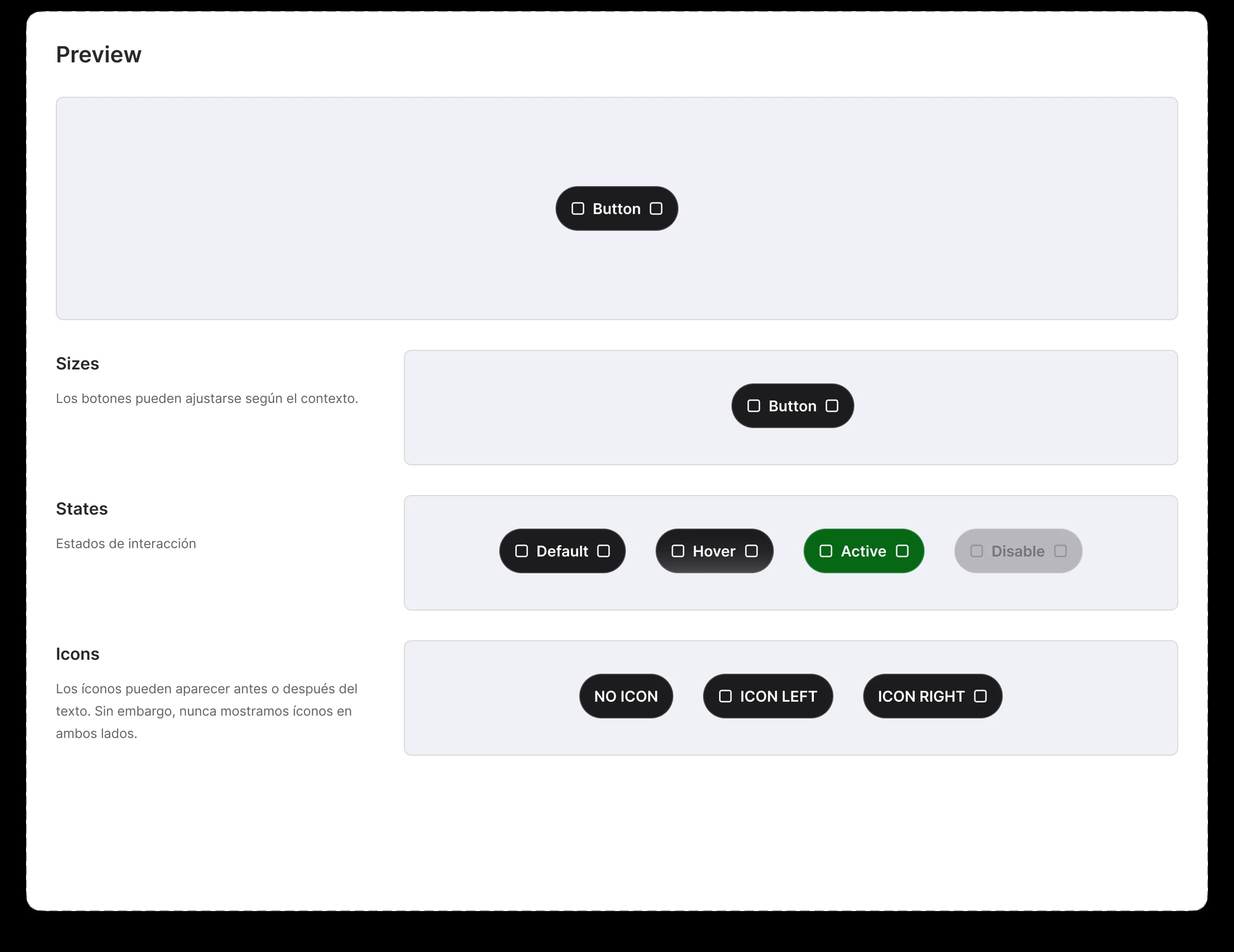
Four documented interaction states, with active in the brand green.
A usage rule, not just a sample: the icon goes before or after the label, never on both sides.
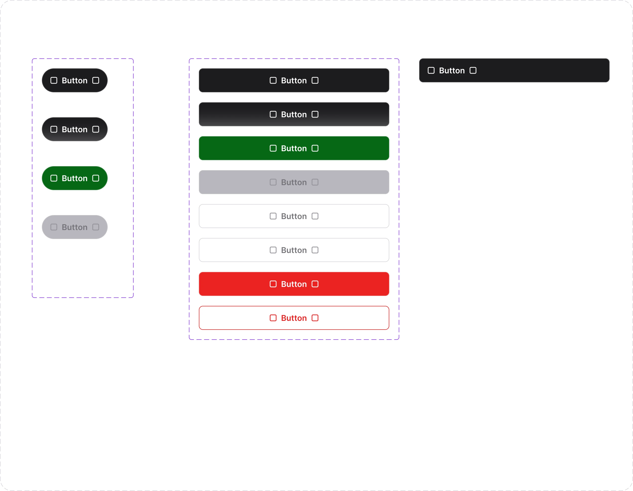
Button variants · page 09 — ButtonView full size ↗
The pill, with its four states: default, hover, pressed and disabled.
On the rectangle, the “State” property holds eight values: four are states and four are visual variants (transparent, white and two delete styles). Today I’d split variant, state and size.

Custom icons · page 05 — Icon libraryView full size ↗
Account and notices: profile, payments, messages, favorites, security, notifications and social. They all share one shape: a rounded colored tile with a white glyph.
One icon per content type: module, route, book, concept and article.
Reading and help actions: save an article, FAQ and reading in progress.
Tiles have their own range of colors, separate from the status colors. Color helps you tell one icon from another at a glance; it doesn’t say whether something went right or wrong.
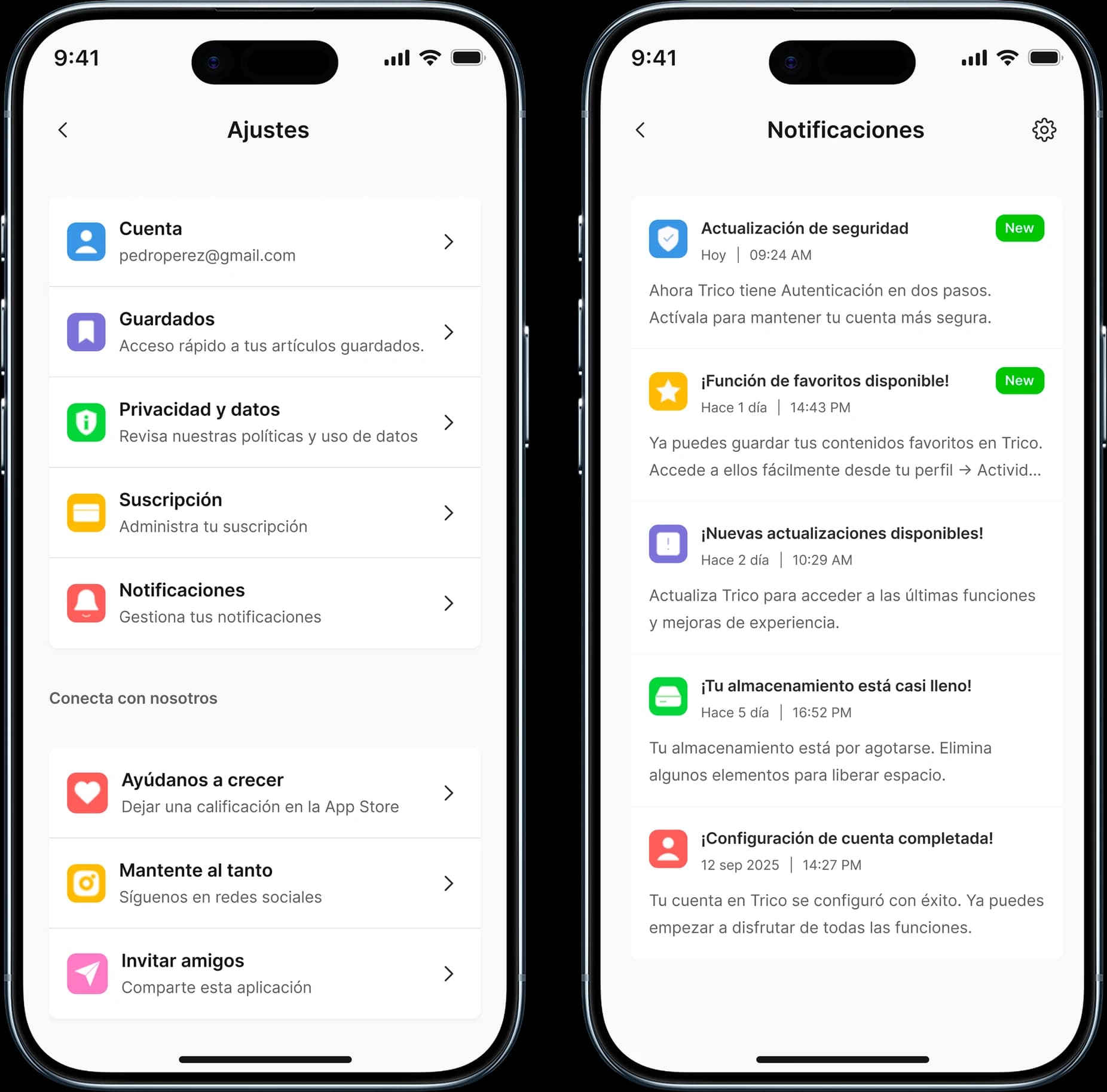
From system to screen · Settings and NotificationsView full size ↗
In Settings, the tile identifies each option before you read it: account, saved items, privacy, subscription, notifications and three ways to connect with Trico.
In system notifications, the icon tells you what each notice is about: security, a new feature, an update, storage or the account.
07
Designing what nobody looks at
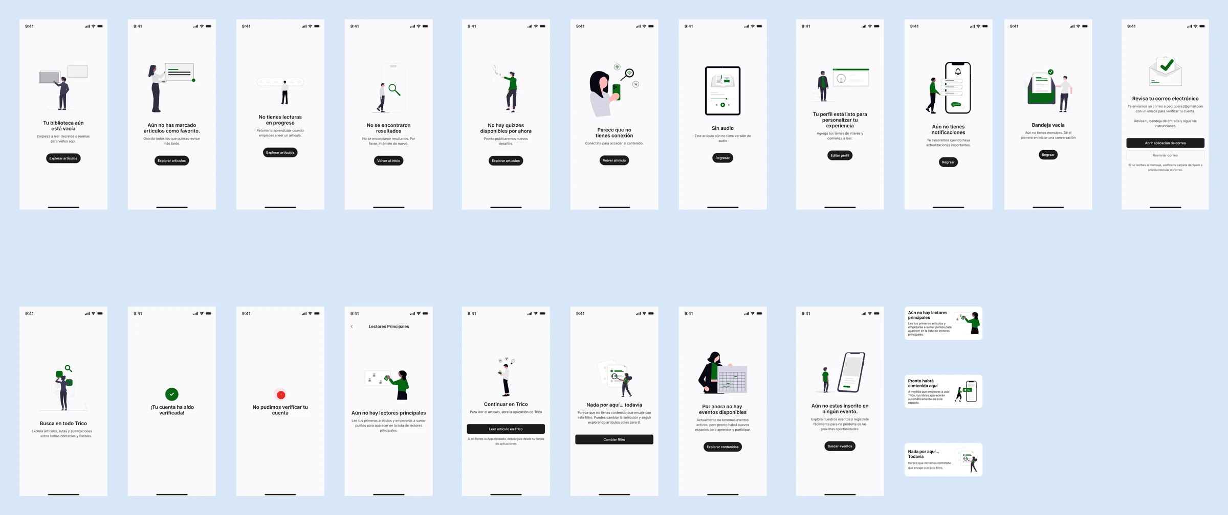
Habits break at the edges: a search with no results, an article without audio, a dropped connection. So the design didn’t stop at the happy path. Every empty state explains what’s going on and offers a way forward, and every error says what to fix.
- Mobile screens designed
- 394
- Empty states
- 26
- Success, warning and error notices
- 29
- Sign-in error paths
- 10

08
Habits are designed outside the app too
If the goal was getting people to come back, the app couldn’t be the only touchpoint. I designed 28 email templates for the whole lifecycle: welcome and confirmation, reading check-ins, progress, rewards, inviting colleagues, premium trials, satisfaction surveys, and alerts for new articles and learning paths.

09
Outcome
I delivered Trico to the client with nine designed modules, including learning paths with progress tracking, an audio player, regulation duels, a ranking, Trico AI with decree summaries, events and community, a subscription flow with PSE, PayPal and cards, and a support-request system.
Before launch, more than 2,000 professionals joined the waitlist with no paid ads. I left the agency once the product was delivered, so I don’t have usage data after that. If I were still on the project, I’d measure success by what defines a habit:
- 7- and 30-day retention.
- Days per week with at least one read or listen.
- Share of people who finish a learning path.
- Audio minutes per session, to see whether learning on the go really sticks.
“Liberman understood from day one that we weren’t just building an app: we were building the study habit of thousands of accountants and lawyers. It shows in every screen.”
10
What I’d do differently
I’d define how to measure the habit from day one. It was the product’s core goal, and it’s the data point most missing today.