01 / Trico · 2025–2026
Turning tax-law updates into a daily habit
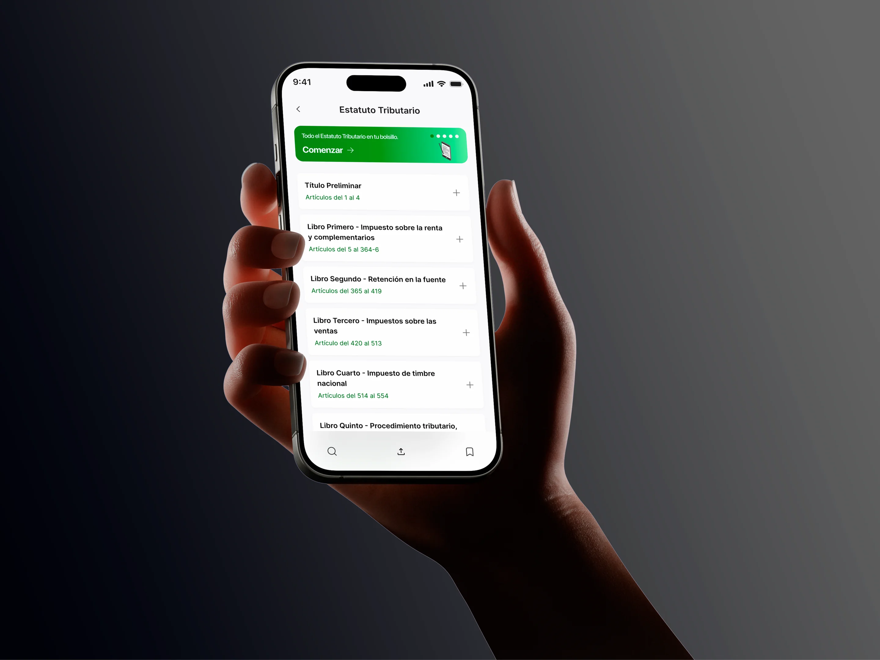
Design engineering · 01 · System
Tokens in Figma Variables with light and dark modes, exported to CSS and React components. This page is built from the same files the site runs on: when a token changes, the docs change with it.
ITurn on Inspect, top right: every component on this page tells you what it’s made of, and holding Alt measures the distance between two elements.
01
Figma holds the values; the repo is the source of truth. Between them sit two scripts and no manual steps.
Figma Variables
Variables and text styles
Four collections: primitives, semantic with Light and Dark modes, spacing and shape, and motion. Type lives in text styles.
Export
design/tokens/figma-export.json
Variables exactly as they leave Figma, committed to the repo so every change shows up in the history.
DTCG tokens
scripts/figma-to-dtcg.mjs
Turns each variable into the standard token format and keeps aliases intact: a semantic token still points to its primitive.
CSS
scripts/build-tokens.mjs
Style Dictionary writes tokens.css: primitives as custom properties, semantic tokens with light-dark(), and text classes with fluid sizes.
Components
src/components
They only read semantic tokens. A hard-coded color in a component is a bug, not a shortcut.
color/text/accentLight → blue/500 · Dark → blue/300"$value": "{color.blue.500}"--color-text-accent: light-dark(var(--color-blue-500), var(--color-blue-300));02
A short palette: paper and ink for light mode, night and snow for dark, and a single blue accent. Components never use it directly; they go through semantic tokens.
paper
ink
night
snow
blue
Each semantic token has one value per mode. The site follows your operating system until you pick a mode with the Theme button. 15 of 15 semantic tokens point to a primitive in both modes. None has a value of its own.
| Token | Light | Dark |
|---|---|---|
bg-canvas | paper.50 | night.950 |
bg-surface | paper.0 | night.900 |
bg-sunken | paper.100 | night.800 |
bg-inverse | ink.900 | snow.100 |
bg-accent | blue.500 | blue.300 |
bg-accent-subtle | blue.100 | blue.900 |
bg-artifact | paper.0 | paper.0 |
text-primary | Aaink.900 | Aasnow.100 |
text-secondary | Aaink.700 | Aasnow.300 |
text-tertiary | Aaink.500 | Aasnow.500 |
text-inverse | Aapaper.0 | Aanight.950 |
text-accent | Aablue.500 | Aablue.300 |
line-grid | ink.a10 | snow.a10 |
line-strong | ink.a20 | snow.a20 |
line-accent | blue.500 | blue.300 |
The text and background pairs the site actually uses, computed from each mode’s real values. The lowest is 4.7:1; the AA minimum for body text is 4.5:1.
| Text on background | Light | Dark |
|---|---|---|
text-primary / bg-canvas | Aa16.2:1 AAA | Aa16.8:1 AAA |
text-primary / bg-surface | Aa17.5:1 AAA | Aa15.6:1 AAA |
text-primary / bg-sunken | Aa14.4:1 AAA | Aa13.9:1 AAA |
text-secondary / bg-canvas | Aa10.1:1 AAA | Aa9.6:1 AAA |
text-secondary / bg-surface | Aa10.9:1 AAA | Aa9.0:1 AAA |
text-secondary / bg-sunken | Aa9.0:1 AAA | Aa8.0:1 AAA |
text-tertiary / bg-canvas | Aa5.3:1 AA | Aa5.7:1 AA |
text-tertiary / bg-surface | Aa5.7:1 AA | Aa5.3:1 AA |
text-tertiary / bg-sunken | Aa4.7:1 AA | Aa4.8:1 AA |
text-accent / bg-canvas | Aa5.5:1 AA | Aa7.2:1 AAA |
text-accent / bg-surface | Aa6.0:1 AA | Aa6.7:1 AA |
text-accent / bg-sunken | Aa4.9:1 AA | Aa5.9:1 AA |
text-inverse / bg-accent | Aa6.0:1 AA | Aa7.2:1 AAA |
text-inverse / bg-inverse | Aa17.5:1 AAA | Aa16.8:1 AAA |
text-accent / bg-accent-subtle | Aa5.1:1 AA | Aa5.4:1 AA |
03
Satoshi for reading, Geist Mono for labels. Styles of 32 px and up scale with the screen: the size listed is the maximum.
t-display-xlSatoshi 500 · 112/0.95 · -0.03emHome hero
One system over a thousand exceptions
t-display-lSatoshi 500 · 96/0.95 · -0.03emCase title and contact CTA
One system over a thousand exceptions
t-display-mSatoshi 500 · 72/1 · -0.02emNext case
One system over a thousand exceptions
t-heading-xlSatoshi 500 · 64/1 · -0.02emKey figures
One system over a thousand exceptions
t-heading-lSatoshi 500 · 48/1.05 · -0.015emSection title or case in a list
One system over a thousand exceptions
t-heading-mSatoshi 500 · 40/1.1 · -0.01emSection intro, guiding question
One system over a thousand exceptions
t-heading-sSatoshi 500 · 32/1.15 · -0.01emPrinciples
One system over a thousand exceptions
t-titleSatoshi 500 · 22/1.25 · -0.005emCard title
Systems for products that keep evolving
t-leadSatoshi 400 · 20/1.45Hero subtitle
Systems for products that keep evolving
t-body-lSatoshi 400 · 18/1.55Case body text
Systems for products that keep evolving
t-body-mSatoshi 400 · 16/1.5General text
Systems for products that keep evolving
t-body-m-strongSatoshi 500 · 16/1.5Buttons, links
Systems for products that keep evolving
t-body-sSatoshi 400 · 14/1.45Navigation, metadata
Systems for products that keep evolving
t-body-s-strongSatoshi 500 · 14/1.45Small emphasis
Systems for products that keep evolving
t-body-xsSatoshi 400 · 13/1.4Chips
Systems for products that keep evolving
t-body-xs-strongSatoshi 500 · 13/1.4Pills
Systems for products that keep evolving
t-quoteSatoshi 400 · 28/1.25 · -0.005emQuotes and testimonials
Systems for products that keep evolving
t-label-monoGeist Mono 400 · 12/1.2 · 0.06emUppercase labels
Systems for products that keep evolving
04
A 4 px scale. Steps grow as space separates bigger things: 4 between an icon and its label, 96 between sections.
space-14space-28space-312space-416space-520space-624space-832space-1040space-1248space-1664space-2080space-2496space-30120radius-sm6radius-md12radius-lg16radius-full999stroke-default1stroke-accent205
Durations and curves are tokens too. With reduced motion on, every duration drops to 0 and the site shows up without animating.
You have reduced motion on: the bars jump to the end without animating.
Duration · with ease-standard
Curve · over duration-deliberate
06
Every component has the same name in Figma and in code. Figma only holds the variants; hover, focus and disabled are handled in CSS.
Figma properties: Variant=Outline|Accent, Size=M|S
Compact labels and controls. The ones that act are buttons; the ones that inform are text.
Figma properties: Variant=Primary|Secondary|Ghost
Hover, focus and disabled are handled in CSS; Figma only holds the variants.
Decision · 2026-10-05Variant and state kept apart: Figma only holds variants and CSS handles states, so combinations don’t multiply.
Figma properties: Media=Right|Left
Label, title and three pills: role, platform and project status.
01 / Trico · 2025–2026
Figma properties: State=Default|Hover
Label, title, body and link. The whole card is clickable; focus shows on the border.
01 · System
Figma Variables with light and dark modes, exported to CSS and React components.
02 · Exploration
A hydration app with offline logging, Supabase and physics-driven bubbles drawn in Skia.
Coming soon
Figma properties: Label, Meta, Show meta
Numbered mono label with an optional detail on the right.
Section header
The header and the footer are system components too: they sit at the top and bottom of this page.
07
Few rules, no exceptions. Each one says how it’s kept.
RuleTwo named modes, Light and Dark, each with its own palette.
How it’s keptDark mode uses night and snow instead of inverting light. The semantic table shows both side by side.
RuleEvery semantic token points to a primitive.
How it’s keptThe site build stops if an alias points to a primitive that doesn’t exist.
RuleNo component uses a loose color.
How it’s keptComponents only read semantic tokens, which is why the same code works in both modes.
RuleIn Figma, components only have variants.
How it’s keptCSS handles hover, focus and disabled, so combinations don’t multiply in the file.
RuleAll text passes AA in both modes.
How it’s keptContrast on this page is computed on every build from each mode’s real values.